
How to Build a Custom Object Lightning Data Table in Salesforce: Step-by-Step Guide

Introduction: A Custom Lightning Data Table provides more flexibility and customization options. It provides various options to view records and perform actions like sorting, filtering, inline editing directly on the data table itself. It also allows to build advanced features like custom input fields and combobox fields.

Problem Statement
While using standard lighting data table one of the major problem is that we can’t enable complex features like custom input fields and combobox fields.

Proposed Solution
We need to use a Custom Lightning Data Table to incorporate advanced features such as custom input fields and comboboxes.
Comparision between standard lightning data table & custom lightning data table:
| Standard Lightning Data Table | Custom Lightning data Table |
|---|---|
| Pre-built functionality for displaying data in a tabular format | Through this we can enable complex features like custom input fields, combobox fields |
| Standard data tables are easier to maintain | Highly customizable to meet specific business requirements |
| It handles only standard Salesforce data types | It supports custom data types and complex data structures |
| Through this we can’t enable complex features like custom input fields, combobox fields | Requires more efforts for development and maintenance |
Outcome
To create custom lightning data table below are the component to be built. We have taken example of Account object to showcase the data table.
- CustomField
- CustomDataTable
- customInput
- customCombobox
- AccountDataTable
1. customField
CustomFields enable us to include fields from object.
We can define customFields with various data types, such as text, number, date, or picklist. For implementing customFields requires development effort to integrate data sources, define field mappings, and ensure data consistency.
customField.JS File
export default class CustomField extends LightningElement {
@api name;
@api value;
@api options;
@api rowid;
@api inputtype = ‘text’;
@api formatter;
@api step;
@api checked;
@api isComboboxField = false;
@api isInputField = false;
handleonchange(event){
const evt = new CustomEvent(‘changecustomfield’, {
composed: true,
bubbles: true,
cancelable: true,
detail: {
result: { rowId: this.rowid, data:event.target}
},
});
this.dispatchEvent(evt);
}
}
customField.HTML File
2. customDataTable
It introduces two custom field types, “input” and “combobox,” and associates them with custom templates custominputfield and customcomboboxfield.
Here we need to create additional HTML Files.
- customInput
- customCombobox
import custominputfield from ‘./customInput.html’;
import customcomboboxfield from ‘./customCombobox.html’;
export default class CustomDatatable extends LightningDatatable {
static customTypes = {
input: {
template: custominputfield,
typeAttributes: [‘inputtype’, ‘formatter’, ‘step’, ‘rowId’, ‘name’, ‘value’, ‘checked’]
},
combobox: {
template: customcomboboxfield,
typeAttributes: [‘name’, ‘value’, ‘options’, ‘rowId’]
}
};
}
customDataTable.HTML File
1.customInput
This code uses a custom Lightning web component (c-custom-field) to render a custom field with various attributes dynamically set based on the values of typeAttributes.
customInput.HTML File
2.customCombobox
It provide users with a dropdown selection interface within specific table columns. It ensures data consistency, improves data entry efficiency, and supports dynamic options based on context.
customCombobox.HTML File
For Importing lightning data table features we are creating another component.
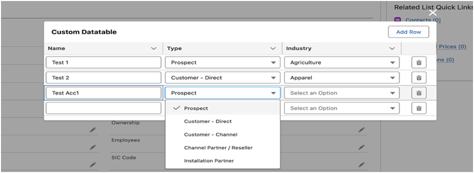
3. AccountDataTable
This lightning web component creates a dynamic data table with editable rows and columns, allowing users to add rows, edit cell values (text or dropdown), and delete rows.
AccountDataTable.JS File
export default class AccountDataTable extends LightningElement {
typeValues = [
{label: ‘Prospect’, value: ‘Prospect’},
{label: ‘Customer – Direct’, value: ‘Customer – Direct’},
{label: ‘Customer – Channel’, value: ‘Customer – Channel’},
{label: ‘Channel Partner / Reseller’, value: ‘Channel Partner / Reseller’},
{label: ‘Installation Partner’, value: ‘Installation Partner’},
];
industryValues = [
{label: ‘Agriculture’, value: ‘Agriculture’},
{label: ‘Apparel’, value: ‘Apparel’},
{label: ‘Banking’, value: ‘Banking’},
{label: ‘Biotechnology’, value: ‘Biotechnology’},
{label: ‘Chemicals’, value: ‘Chemicals’},
];
columns = [];
rowIndex = 0;
@track accounts = [];
connectedCallback(){
this.accounts = [
{Name: ‘Test 1’, Type: ‘Prospect’, Industry: ‘Agriculture’, rowId: this.rowIndex++},
{Name: ‘Test 2’, Type: ‘Customer – Direct’, Industry: ‘Apparel’, rowId: this.rowIndex++},
{Name: ‘Test 3’, Type: ‘Customer – Channel’, Industry: ‘Banking’, rowId: this.rowIndex++}
];
this.columns = [
{ label: ‘Name’, fieldName: ‘Name’, type: ‘input’,
typeAttributes: {
inputtype: ‘text’,
value: { fieldName: ‘Name’ },
name: ‘Account Name’,
rowId: { fieldName: ‘rowId’}
}
},
{ label: ‘Type’, fieldName: ‘Type’, type: ‘combobox’,
typeAttributes: {
name: ‘Account Type’,
options: this.typeValues,
value: { fieldName: ‘Type’ },
}
},
{ label: ‘Industry’, fieldName: ‘Industry’, type: ‘combobox’,
typeAttributes: {
name: ‘Account Industry’,
options: this.industryValues,
value: { fieldName: ‘Industry’ },
}
},
{
type: ‘button-icon’, initialWidth: 75,
typeAttributes: { iconName:’utility:delete’, name:’Delete’, title:’Delete’}
},
];
}
handleRowAction(event){
const actionName = event.detail;
this.accounts = this.accounts.filter((ele) => {
return parseInt(ele.rowId) !== parseInt(actionName.row.rowId);
});
if (this.accounts.length === 0) {
this.addRow();
}
}
handleOnchange(event){
console.log(JSON.stringify(event.detail.result.data.value));
}
addRow(){
const newAccountRecord = {
Name: ”,
Type: ”,
Industry: ”,
rowId: this.rowIndex++
};
this.accounts = […this.accounts, newAccountRecord];
}
}
AccountDataTable.HTML File
Conclusion
The standard Lightning Data Table is user-friendly and comes with built-in features. The Custom Lightning Data Table offers greater flexibility and efficiency in displaying data, allowing for customizable features tailored to specific business needs. Its seamless integration with Lightning Web Components ensures a smooth user experience and boosts developer productivity.
Author Bio
This article was authored by Satish Dudharamji Thatkar, a Software Engineer – Salesforce Practice at CriticalRiver Inc.